
A universally recognized pattern
The notification bell has become a global interface standard. From social media platforms to SaaS dashboards, users instantly understand what it represents.
This recognition reduces cognitive effort because no explanation is required. When users see the bell icon, they expect updates or important information. Familiarity creates trust and accelerates interaction.
It centralizes attention without interrupting
Unlike popups or modal windows, a bell icon does not force interaction. It signals that something is available without disrupting the current task. Users stay in control and choose when to check notifications.
This balance between visibility and non intrusion is key to good UX. The bell creates awareness without frustration.
It creates a clear feedback loop
When combined with badges or counters, the bell introduces anticipation. A small red dot or number triggers curiosity and encourages engagement.
This micro interaction is powerful because it feels lightweight. Users associate the icon with updates, progress, or social proof. Over time, checking notifications becomes a habitual behavior.
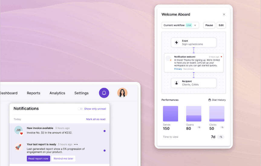
It structures communication in one place
Without a notification center, messages are scattered across banners, tooltips, and emails. The bell acts as a single, consistent access point. Users know where to find past updates instead of searching through the interface.
This centralization reduces confusion and improves perceived organization. Structure at the UI level reinforces clarity at the product level.
It supports scalable product growth
As products evolve, communication needs increase. New features, reminders, collaboration updates, and system alerts all require space.
The notification bell scales naturally with this complexity. Instead of multiplying intrusive prompts, teams can route messages into a structured center. This makes growth sustainable without degrading user experience.

The bell works, but only with intention
Adding a bell icon alone does not guarantee engagement. If the notification center is cluttered or irrelevant, users will ignore it. The effectiveness of the pattern depends on the quality and timing of messages behind it.
Clear triggers, meaningful content, and controlled volume are essential. When thoughtfully implemented, the notification bell becomes a quiet but powerful growth lever.

